What Is the Color of Physical Therapy – Physical therapy (PT) plays a significant role in health and wellness, offering recovery and rehabilitation for patients of all ages.
While we often discuss its techniques, benefits, and practices, a more abstract question has emerged in recent years: What is the color of physical therapy?
This question touches on branding, symbolism, psychology, and how visual elements contribute to how we perceive health services.
Let’s explore the color associations of physical therapy from multiple perspectives, including branding, therapeutic psychology, patient perception, and industry standards.
The Role of Color in Healthcare
What Is the Color of Physical Therapy – Colors are more than visual experiences—they affect mood, influence decisions, and shape perceptions.
In healthcare, specific colors have long been associated with particular fields. For example:
- Red is linked to emergency care and urgency.
- Blue represents trust, calm, and professionalism.
- Green is associated with healing, growth, and nature.
- White symbolizes cleanliness, purity, and sterility.
These associations often guide branding and design decisions in hospitals, clinics, and therapy centers.
Common Colors Associated With Physical Therapy
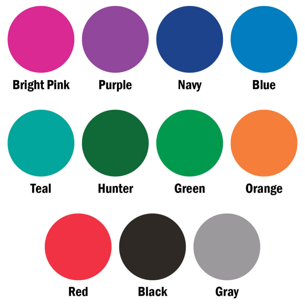
While there is no official or universal “color of physical therapy,” several colors are commonly associated with the field.
Each one reflects different aspects of the profession:
1. Green – Healing and Renewal
Green is often considered the most appropriate symbolic color for physical therapy. It represents:
- Healing and recovery
- Physical and emotional renewal
- Natural growth and balance
Since PT is focused on restoring function, mobility, and strength, green embodies these restorative goals.
2. Blue – Trust and Professionalism
Blue is another frequently used color in physical therapy branding. It conveys:
- Calmness and reliability
- Safety and professionalism
- Therapeutic tranquility
Physical therapists aim to build strong relationships with their clients, and blue helps reinforce a sense of trust and care.
3. Teal or Aqua – Freshness and Clarity
Teal or aqua shades are popular for their blend of green and blue qualities. These hues can suggest:
- Clean energy
- Innovative and modern care
- Emotional calm
Teal has become a modern branding choice for many therapy clinics seeking a fresh, contemporary look.
4. Purple – Transformation and Care
Though less common, purple can be seen in practices that emphasize
- Holistic healing
- Emotional transformation
- Compassionate care
It combines the stability of blue and the energy of red, sometimes appealing to clinics with a wellness or alternative therapy approach.
Physical Therapy Branding: Color in Logos and Clinics
What Is the Color of Physical Therapy – Most physical therapy clinics choose brand colors carefully to reflect their mission, vision, and values.
A quick look at PT businesses reveals common color themes:
- Green and blue combinations dominate the field, communicating a balance of care and expertise.
- Soft, earthy tones are often used in private or boutique therapy practices to create a peaceful, home-like setting.
- Bright, energetic colors like orange or yellow may appear in pediatric or sports therapy clinics, where vibrancy and motivation are key.
Color not only defines logos and websites but also informs interior design, staff uniforms, and promotional materials.
Color Psychology and Patient Response
The colors used in a therapy environment can influence a patient’s mindset and recovery experience.
For example:
- Cool colors like green and blue are calming, reducing anxiety and encouraging focus during treatment sessions.
- Neutral tones create a sense of cleanliness and clarity, helping patients feel at ease.
- Warm colors like yellow or orange can add energy and encouragement, but must be used carefully to avoid overstimulation.
Studies in healthcare design show that color choices can improve patient satisfaction and even outcomes.
A well-designed therapy space using color intentionally can foster trust, motivation, and relaxation.
Color Codes in Medical Professions
In some hospitals and institutions, color-coded uniforms help differentiate roles:
- Physical therapists may wear green, blue, or grey uniforms, depending on the facility’s guidelines.
- Occupational therapists, nurses, and technicians also follow distinct dress codes for easy identification.
While these standards vary across regions and institutions, green and blue remain popular choices for physical therapists due to their symbolic meaning and patient-friendly tone.
Color in Therapy Equipment and Tools
Physical therapy involves a wide range of tools and equipment, many of which use color for functional reasons:
- Resistance bands come in color-coded strengths (e.g., yellow for light, red for medium, and black for heavy).
- Balance balls, weights, and foam rollers often feature vibrant colors to indicate size, use, or intensity.
These colors not only aid the therapist’s workflow but also engage patients in a visually stimulating and motivating environment.
Using color-coded tools helps streamline rehabilitation exercises and makes therapy more intuitive, especially for children or older adults.
Cultural and Regional Variations
Cultural context also plays a role in how color is interpreted:
- In Western cultures, green and blue are heavily associated with healing and healthcare.
- In Eastern cultures, green still represents balance and harmony, but colors like red may carry additional significance tied to vitality or life energy.
Understanding these nuances is important when designing therapy spaces for diverse populations.
Future Trends in Color and Physical Therapy
What Is the Color of Physical Therapy- As therapy becomes more holistic and personalized, color choices are expanding:
- Soft pastels and organic tones are being incorporated into wellness-focused clinics.
- Digital platforms for telehealth are using blues, purples, and greens to signal professionalism and calmness online.
Inclusive design also encourages the use of colors that are accessible to those with visual impairments, such as high-contrast color schemes.
The future of physical therapy color design is moving toward thoughtful, inclusive, and evidence-based decisions that enhance both clinical outcomes and patient comfort.
Conclusion
What Is the Color of Physical Therapy? – While there’s no official “color” of physical therapy, green and blue stand out as the most representative colors of the profession.
Green symbolizes healing, renewal, and balance, while blue conveys trust, calmness, and professionalism—core attributes of physical therapy practice.
Color affects how patients perceive care, influences branding choices, and can even impact recovery outcomes.
From logos and uniforms to clinic interiors and therapy equipment, color serves as a silent communicator in the physical therapy experience.


